Introduction
Project Overview
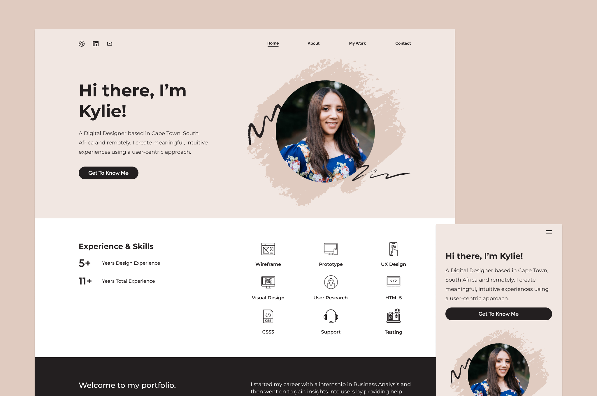
A portfolio is a collection of your best project work. It tells the story of who you are, what you do, how you do it, and the value you can bring to a company or organization. My portfolio at the time was outdated as well as it wasn’t responsive.
Project Objective
Create a responsive, inclusive, effective, engaging and relevant portfolio website showcasing my skills, projects and achievements as a Digital Designer.
Challenges
- I initially struggled with the design direction I wanted to go in after having viewed numerous examples for inspiration.
- I aimed to build my portfolio as soon as possible however I only had a limited available timeframe each day to work on it. This added extra pressure.
- With my first iteration I attempted to build my portfolio completely from scratch. The first challenge was deciding which tech stack to use. I have a limited PHP / Javascript toolset (knowledge) and ran into a few issues. Due to the development issues the progress of my portfolio stagnated after which I decided to use a website builder to implement my designs.
My Role
- UI / Visual Designer | Web Designer
Tools
- Figma
- WordPress
- Elementor
My Design Process
01 Empathise
I researched the outline and structure of a design portfolio and then compared that to my current portfolio.
02 Define
I defined my need (a responsive, inclusive, effective, engaging and relevant design portfolio in the form of a website) and the problem (current portfolio was outdated and not responsive).
03 Ideate
I drew a mindmap of the content or sections which I thought were most important for a design portfolio. I sourced examples for inspiration. I narrowed down the examples I liked the most and then placed these together to form the website.
04 Prototype
Based on the ideation phase, I created the mockups in Figma and kept iterating on them.
05 Test
Once built, I tested my portfolio on all browsers as well as mobile / tablet (using my cellphone or mobile browser simulators). I also compared it to the designs.
The Design
UI Design
I mocked up the designs using Figma. My goal was to create a visual identity that is reflective of my personality. I opted for a neutral color palette that reflects simplicity, minimalism, subtlety and elegance. The colors are chosen to invoke calmness, tranquility and ease in viewing my portfolio.

Learnings
01 Create project milestones
As I got further into the project I felt a bit overwhelmed. I kept looking at the project as a whole everyday and what I still needed to do whereas I should’ve created multiple small tasks for myself to work towards reaching the finished product.
02 Keep iterating
Keep the content updated and iterate the design from time to time so that I do not end up in the same place where my portfolio needs a complete overhaul.
03 Set realistic deadlines
I didn’t set any timelines as I just wanted a portfolio as soon as possible. Setting timelines would’ve alleviated some self induced pressure.
